Blog Widget by LinkWithin

LET'S TALK TUESDAY | No. 2 :: Book Club, App + Paint Color

Tuesday, January 19


Brrrr! It's another cold winter day here in Florida my friends!!
(currently 39º - high of only 55º). That's cold for this Florida girl.

Let's warm up together with our "Let's Talk Tuesday" No. 2 today. (click here if you missed No. 1 and find out more about the inspiration behind the NEW LTT blog series here on Pen + Paper Flowers if you missed the original announcement).

I have another set of fun questions I'm excited to answer today.
I'm just loving this little bit of time we are carving out each week to connect for a few minutes on a very real level - like friends meeting up over coffee or hot cocoa!


QUESTION #1:
Q: I loved the Book Club you were doing last year but I haven't seen any updated posts in awhile. What happened? Am I missing something? - Maria B.

A: Oh my! I'm embarrassed to admit this but the truth is...life is what happened. After going strong from January until August, I missed posting in September...and then October and before I knew it, it'd been three months and there was no way to catch up at that point.

The good news is, I've been brainstorming some ideas to update the PNPF Book Club to make it a little more simple...a bit LESS complicated. How about I skip the "review" part of things, which was the original concept of the Book Club, and just do a quick list of my current reads every month? What do you think? BTW: Here's one for you: "Whatever You Are, Be a Good One" by Chronicle Books. (Clara gave it to me for Christmas).

QUESTION #2:
I just love the inspirational thoughts you share on Instagram and I'm wondering if there's a specific app you use to create them? I think it might be the Rhonna Designs app but I thought I'd just ask.  - Amanda G.

My favorite app to use is called Phonto. It's SUPER easy and allows me the flexibility I prefer for manipulating fonts and letters. I actually just select the "plain image" option and then select the blank white square to add my wording. That's it. Now, having said that, I do love using the Rhonna Design
App when I want to add some cute design elements. And of course, I'm always using my favorite design program, Adobe Illustrator, for designs as well.


QUESTION #3:
Q: I just love your simple style - both with your designs and some of the images I've seen of your home decor. You'd mentioned awhile ago that you were in the middle of deciding on a paint color for your master bedroom. I'm in the middle of a master bedroom makeover and I'm curious as to what color you ended up choosing. Natalie P.

That's so funny you asked about this because I was at the paint store just YESTERDAY having a gallon mixed up to test out on the master bedroom. I never did paint the master as previously mentioned a year or so ago because I still wasn't convinced of the colors I'd chosen and I just sat on them. In fact, I've still got paint swatches on the walls and I just keep adding to them any time I'm inspired by a color I see on Pinterest or social media and any color recommendations from family and friends.

I'm not sure why, but I've been really stumped with what to do or what direction I want to go in for that room. I can't tell you how many "this is the one" moments I've had with paint colors only to sit on it for a few days and then change my mind altogether. (what is that?) Grrr. So...in keeping with my One Little Word (LESS)...I'm doing less second guessing, less procrastination and I will be moving forward..with confidence by the way...with the custom paint color I had mixed yesterday!


It's a color of happenstance because it was two different leftover paint colors Emalyn decided to mix together on a whim when she re-painted her bedroom a few months ago. Can you believe that? I LOVE the color she ended up with (shown on the top paint stick) so I had it custom matched and then used 50% of the formula for a lighter/brighter hue in the master bedroom. (bottom paint stick). And...yes, it's another creamy white neutral. My mom is SO rolling her eyes right now. And maybe you are too!? *blushing*

I'll share before and after pics soon! For now, I wanted to share a photo of the final Behr paint formula I'm using in the master bedroom, just in case you want to run right out and try it yourself!! 
Let's call the custom color: Happenstance.

Okay, and one more thing...
Have any of you seen the SureSwatch™ sheets? I noticed them for the first time at the Home Depot paint counter yesterday while waiting for my paint to be mixed. The concept sounds pretty cool - but I left without paying the $3 for one sheet. Now after having watched the how-to SureSwatch™ paint and SureSwatch™ Primer Decider videos online to learn more, I'm even more curious about whether or not they'd really work and if they'd be worth it? If you've used them I'd love to know what you think!! And if you haven't, would you consider using them?

Was that fun? Feeling a little more connected? I know I am.
Until next week friends...keep your questions coming!!

DIFFERENT WAYS TO SUBMIT YOUR QUESTIONS
1. Email me directly: pnpflowersinc AT gmail DOT com
2. Leave a question on my Instagram feed anytime.
3. Leave it as a comment here on the blog.
If you ever have any issues at all being able to leave a comment on my blog, please email me directly to let me know so I can figure out how to resolve it for you: pnpflowersinc AT gmail DOT com

xoxo!!

KEEPiNG iT REAL
I thought it'd only been a little over a year ago that I started putting different paint swatches on the walls in the master bedroom but when I went back to look at the original post about choosing a paint color I realized it was from August of 2013! Oh my goodness. That's just ridiculous. Now I'm embarrassed. See!! I've REALLY been stuck. For too long. Here's to LESS procrastination! *blushing*

CRAFT | She Lets Creativity Blossom Art Canvas

Tuesday, April 29


Want to know how I created this Art Canvas I shared with you yesterday for the Darice booth at SNAP!?

I used a 1.5" round craft punch and cut out a whole bunch of circles from the Core'dinations "Tillie Spotted" and "Jillian Dot" card stock packs - selecting only the colors that were bright and happy.  I just LOVE the texture of the "polka dots" of these two collections and the fun colors available. Seriously! Look at how adorable all of this texture and color is.  For fun, I also threw in a few gold glittered card stock circles from American Crafts just to add a splash of "glam" to the overall piece.


I used the brown "Tillie Spotted" card stock (the one with the larger polka dots) and used a pencil to sketch out a tree skeleton and then I cut it out with scissors.

I then used a piece of fine sandpaper to showcase the "color core" feature of the Core'dinations paper. I intentionally left the two large side pieces of the tree in the picture (shown below) to show you the side-by-side difference after sanding. Cool, right?


I secured the tree skeleton to the canvas using Ultra Thin Glue Dots and then I just started placing the various colored circles on the branches of the tree. In order to secure the paper circles, I chose two different types of Glue Dots. (Ultra Thin and Pop Up). I used the Ultra Thin on most of the circles but then used the "Pop Up" glue dots to create a little dimension for a handful of the top layer of circles.  I even found myself stacking two of the Pop Ups together to give some of the paper circles a little more height. 


Then I lightly sketched out an inspirational quote with a pencil on the canvas and painted over it with black acrylic paint.

TIP: Use a white eraser for the sketching part just in case you don't like the way it looks the first, 2nd or maybe even 3rd time. *wink* Make sure you erase lightly so as not to create any dents, creases or damage to the canvas.


I hope you're inspired to create something similar.
This would actually make a really pretty Mother's Day gift, don't you think? If your mom is a creative-type. Otherwise you could swap out the quote for something more fitting for your mom.

Anyway…I can see this in a baby's nursery or even as a creative back drop for dessert tables too - on a much larger scale. How about creating an oversized popsicle on a stick for a kids room? Or a pretty butterfly? There's no limit in the creative things you can do using the basic concept of punching circles from this fabulous textured card stock.

What are you inspired to make after seeing this? I'd love to know!

MATERIALS USED FOR THIS PROJECT:


KEEPiNG iT REAL
It took me forever to decide on just the right quote.
Seriously, you don't know how long I fretted over this.
I knew it couldn't be too wordy because of limited space and I knew I wanted it to be something related to "creativity" since it would be displayed in the Darice booth. BUT I also wanted it to be something I, (or anyone), could hang in their studio or creative space. I like it. I think it turned out just right.

CRAFT | Rainbow Dot Mini Wood Spoons

Tuesday, August 6

I'm completely smitten with the wooden utensil trend that has taken over the party styling world.
What's not to love about an item that is eco-friendly...
completely versatile for just about every occasion...
and absolutely screams "get crafty and personalize me!"

I've been itching to do something creative with them, other than using Chalkboard Paint for creating the "plant marker" dessert spoons I created for the party I styled for Martha Stewart, and today I have a crazy simple painting idea to share with you. Something so simple you'll wonder why I even bothered to create a brief tutorial about it. *wink*

Rainbow Dot Mini Wood Spoons


Ever since my friend Kim created a Rainbow Heart party for her daughter Kate...
I'm convinced there has been a resurgence

LIFE | My search for the elusive Tendregris

Friday, August 2


I've just started the early steps towards making over our Master Bedroom.
It's been something I've been thinking about and putting off for a long-time.

My process for transforming this room started with selecting the wall color.
I pulled out the "Country French" magazine I've been keeping for years as a reference for a color
I've been searching for ever since I saw it mentioned in the pages.

"In France, the ubiquitous color called tendregris (soft grey) is everywhere. It morphs to a green or blue depending on the light and the season."


I decided THIS would be the color for the Master Bedroom.
The fact that it morphs into different colors depending on the light/season is perfect for my personality...I'm that person who tires of things quickly and is always rearranging furniture for a new look.


With about five different paint samples...
Ella and I began the process of elimination last week by putting up some swatches of color on all four of the existing "Viva Gold" walls in the Master Bedroom.


The paint colors I gravitate towards are typically very neutral.
So you can imagine the shock to my system when we walked into this home for the first time as potential buyers.
Not only was the outside of the home painted a "pumpkin" color...
almost every single wall in the interior of the home matched the exterior! *gasp*

Want proof?
Here are some of  the "before and after" photos I shared with you awhile back...


I much prefer the various "creamy white" colors I chose to paint over the gold, don't you?

So with the rest of the interior walls of the house painted...
our master bedroom has been the only room left to officially banish the viva gold from our home forever! It's been a painful wait, trust me!

After a few days of looking at the color swatches on all four of my walls...
I have made a decision!!


It's clean, fresh, soft, pretty and something different than my standard "creamy white".

Colors Swatches from Top to Bottom:
Sherwin Williams - Blue Hubbard - perfect - I'll take this one!!
Behr Ultra - Lime Light - really like this one too - a little less color than Blue Hubbard!
Behr Ultra - Pensive Sky - too blah!
Behr Ultra - Contemplation - too dark!
Behr Ultra - Light French Gray - too grey!

I almost went with the Lime Light until I remembered I had a paint sample in the garage from a previous paint project.  It was meant to be! It turned out to be just enough added color to bump the "Lime Light" out of the limelight! *wink*

The Blue Hubbard is a discontinued color by Sherwin Williams.
I'll be having Behr match the color and mix me up some Ultra!

My hopes are to get the room completely painted this weekend!!

I'm not sure that's going to happen though since my sweet Ella has been sick this week with the cold she caught from me.  I'm still not even 100% with a super annoying cough I can't seem to get rid of!!

Stay tuned for more details about the pillows I have found for my bed!!


KEEPiNG iT REAL
Although I don't recommend getting a terrible cold and being confined to bed for 3-4 days as a way to really put thought into the color swatches on your walls before making your decision...
I do have to say it worked out pretty good for me. Ha!!

FOUND | Antique Finds

Monday, September 17

Had fun on Saturday browsing Renninger's.
Thought I'd share what we brought home with us...

Antique Wire Whisk & Hand Brooms
whiskandbrooms2371

Small Crate for Apothecary Jars
smallcrate2369

Antique Church Pew
churchpew2375
I have been wanting one of these FOREVER...
and this was a bit less ornate and unique than some of the ones I've seen through the years.

The small crate & brooms will make great props for some upcoming photo styling
and then will transition nicely into some home decor elements around the house.

The jumbo sized wire whisk is part of my collection of antique bakeware and accessories.

And the  church pew...
do you think I should paint it or leave it as-is?
We could go with the ole standby and do a creamy white distressed finish?
or we could go with black distressed?
Or if you have a better idea...
I'd love your feedback.

KEEPiNG iT REAL
I'm definitely intimidated at the thought of painting the pew black.
I've only done creamy whites and the latest RESTYLE I did was a very light Grey-Blue.
Black seems so scary...
I guess because it seems so "final".
But I do LOVE black distressed furniture.

If you don't know...
my home decor style is what I like to call: Vintage French Farmhouse
What do you think?

RESTYLE | The Abandoned Dresser

Wednesday, September 12

Here she is folks...
Meet the newest addition to our family.

IMG_2054


She was sadly abandoned and needed a bit of love when we first met her...
COLLAGE1

But we spruced her up a bit...
(Ella totally helped me sand her down, remove the hardware and helped roll the first coat of paint on).
COLLAGE2

We added a fresh coat of Sherwin-Williams Sea Salt paint...
(which is a subtle blue-grey color - even though these photos make it look like my favorite color: creamy white)
Added some wooden accents to the top drawers...
and then gave her the ole rub down using sandpaper to complete her "Vintage French Farmhouse" look...
and we think she's just gorgeous.
IMG_2066

IMG_2084

COLLAGE3

Although she hasn't found a permanent spot yet...
I'm keeping her here for now...
in anticipation of some upcoming FUN photo shoots.
(Don't mind the decor either - I quickly threw those on top to make her seem a little more "settled in")
IMG_2081
(you can see her subtle blue-grey color a bit better in this photo since she's up against a creamy white wall)

Welcome to your new home.
We hope you love it here.

Materials & Cost:
Dresser - $0
Paint - $0 Sherwin-Williams • Sea Salt (leftover from a previous project) $0
Paint Brush & Mini Roller - $0 (Paint supplies on-hand)
Sandpaper - $0 (leftover from another project)
Wooden Accents - $6 Lowes
Wood Glue - $0 (already had in the garage)
Total: $6

Process:
• Remove hardware
• Lightly sand the entire piece so the paint will stick.
• Wipe down the furniture to remove the dust created from sanding.
• Glue on wood accents to drawers. (I skip the whole "wait 24 hours to dry" suggestion on the bottle. I figure the paint
   will be the added glue it needs to stay put). *wink*
• Apply 1st coat of paint. (I prefer using a brush but Ella used a mini roller to help).
• Add hardware back on.
• Apply 2nd coat of paint with brush.
• Let it dry a bit. (I'm pretty impatient so I don't do the whole "let it sit overnight" thing).
• Sand the edges, features that stick out and the top in just a few places. (Thank you Ema for helping out with this part)
• Bring it inside the house and admire.

I still need to add a protective coating to her - which I have in the garage...
I've just been lazy.


KEEPiNG iT REAL
This is NOT my first "restyle" project.
I've repainted beds, armoires, and various other pieces of furniture in our home.
(I'll have to share those at some point too).

I'm proud of myself for two reasons:
• I didn't let her sit for months before I did something with her. (which can be pretty typical of me).
   3 days from the time we brought her home I jumped into the project. Yay me!!
• $6 was all I spent - besides my time - Can't get much better than that.

Oh...
and I have to just say...
I've been approached several times now by both of my older girls, Clara (16) and Ema (13)
stating their case for the many reasons why the new furniture should go into their rooms.
No way.
No how.
She's mine. *wink*

SHARE | Thirsty Thursday • Recycled Furniture

Thursday, September 6

••••••••••••••••••••••••••••••••••••••
THiRSTY THURSDAY
defined as a day to...
share something...ANYTHING... 
that makes my mouth water...
quenches my creative tastebuds...
satisfies my thirst for inspiration...
or leaves me "creatively parched" 
and ultimately wanting for more...
••••••••••••••••••••••••••••••••••••••
I did it again.
That thing I do sometimes...
That spontaneous, overwhelming response to take action...
to rescue something from certain demise.

I was simply minding my own business...
Full-focused on delightful conversation with my 13 year old daughter...
Finishing up our 3 mile walk together through the neighborhood.
Who cares that it was 9:30 at night...

When all of a sudden...
it was upon us.
Sitting there in the dimly lit street...
in the company of two garbage cans...

THE ABANDONED DRESSER
dresser1988


My heart was racing.
Not from the walking...
but rather from the "thrill of the find".

That abandoned dresser...
just sitting there...
quietly counting down the hours until daybreak...
at which time imminent departure from this world would occur.

Or would it?

I'm always inspired by the "potential" of things.
Especially FREE things.
Yes...
you know what's coming next.
I surely could've stopped right then and there...
throwing my plans for finishing my three miles right out the window.
But no...
I'm a pro at this now.
Having surveyed the situation...
(c'mon...it's 9:30 in the evening...the likelihood of someone else coming by and snagging our find is slim to none)...
I pressed forward on my 3 mile walk...
Casually planning the rescue mission when we were done.
(and hoping J would agree to help).

dresser1993

And so...
finishing the walk at 10 o'clock in the evening...
As we made our way back to the house...
I pulled out my phone to make the call to J.
Following a brief conversation of complaining (on his part)
and some convincing (on my part)...
He agreed to help.
So...
In the dark, quiet hours of the evening...
as my unsuspecting neighbors were preparing for sleep...
We took her home.
We rescued her.

dresser1987

Oh the possibilities that await her...
• paint?
• new hardware?

I can't explain to you how excited I am to breathe new life into her.
(I forgot to mention there's a mirror that came with it too - Bonus!).


KEEPiNG iT REAL
Although there are some people who may be put off by my actions...
and even some who may consider it a "problem" I need help with...
I've decided to view the pleasure I receive from my ongoing desire to restore/rescue abandoned furniture
and home decor items as a gift.
That's right.
A gift... 
because I'm simply unlocking the potential of something no one else found value in.
My little "green" gift of recycling??
Right?
Anyone? *wink*

crafting | wooden mailboxes

Monday, April 18

I absolutely LOVE to paint.
And it really doesn't matter what it is I'm painting...
furniture
walls
canvas
objects
frames
fingernails & toes...

There's just something therapeutic about it for me.
So...
Ella and I took some time on Friday to get a little crafty together by doing some painting:

mailboxpainting1055


It felt tremendously good to spend quality time with Ella doing something fun...
all while working towards accomplishing something I've been excited about...


Since these aren't finished, I don't want to give away all of the details just yet.
I'll be back later this week to fill you in on my thoughts behind this project...
and ultimately the finished details.

I hope you all thoroughly enjoyed your weekend...
Mine was "gorgeous"...


KEEPiNG iT REAL
I didn't say my gorgeous weekend was perfect.
I dealt with major attitude from my two older girls while at the neighborhood family picnic.
It was torture for them to be there...*rolling my eyes*

But I tried REALLY hard to maintain my gorgeous attitude and focus on having fun and being social.
(which I admit is not something we do often enough around here lately). *wink*

CRAFT | "LOVE" letters

Thursday, February 3

I am crazy-excited to share with you this clever little craft project I absolutely LOVE!!

It started out pretty generic with me purchasing wooden LOVE letters for Valentine's Day.
Not an original idea in the least so far, right?
After contemplating what crafting method to use to decorate them...(with paint or mod podge as the primary options)
I finally decided to paint them.


I chose black paint to coordinate with the other black decorative accent pieces around my home...
which also allows me to be "non-committal" on my color scheme selection for Valentine's Day.
(we all know this time next year I'll be wanting something different).
With the letters being black, I can now add whatever accent color I want through the use of various ribbon.

red gingham ribbon for a "classic" Valentine's feel...

very cute. and very simple.

The fun doesn't end there folks...we're just getting started.
Here's where the REAL creative ingenuity comes into play...

I wouldn't consider myself a frugal person...
BUT with that said...
I am always very conscientious as to whether or not a purchase will offer a variety of uses.
So it was bothering me that I was going to spend time painting these letters...
display them for Valentine's Day and then box them up until next year.

That's when this came to mind...


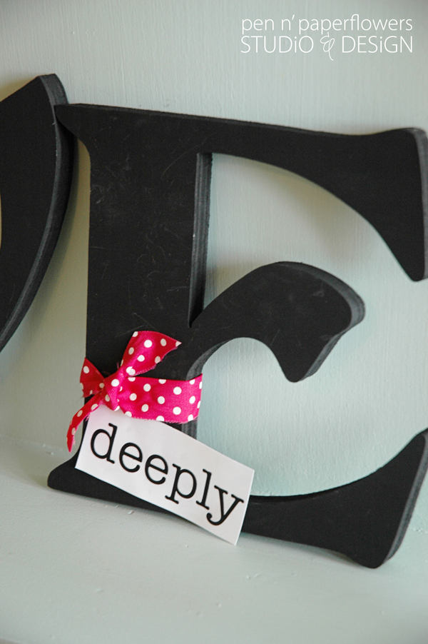
By printing out a variety of "accent" words...
I could do any of the following options for Valentine's Day...


or swap out the ribbon color to pink and white polka dots & add it to only one letter for a different look.


see how it's just tucked up underneath the ribbon - easy!


AND HERE'S the BRILLIANT PART!!!

change up the ribbon color and accent word to reflect the current season...

like this one for SUMMER...  "

or this one for Halloween?

a play on words from the phrase "a fool for love"...*wink*
LOVE this whole concept!!!


There are SO many different things you can do with this one word to personalize it for your home...

This one has a special place in my heart because our big thing with Ella right now is asking her...
"Guess what?"  and she responds "Love You!" Sooo...cute.
(Actually, Ella is now running up to us asking "Guess what?"...and then she responds for us with a resounding "Love You"!)

I kept the concept REALLY simple but feel free to get as creative as you like...
• paint it whatever neutral color you prefer to match your home decor (white, black, vintage blue, etc.)
• wrap the letters with any type of ribbon, fabric, scrapbook paper or just leave it plain
• add any word or a combination of words to make an entire phrase/sentence.
• make the "accent words" fancy by backing them with colored cardstock or turning them into cute tags to hang from your wooden letters.

and guess what...
you can use this same concept using a DIFFERENT word to display in your home year-round...
like "FAMILY"?!

I hope you are inspired.
This is SUCH an easy craft project that will be worth every bit of your time.
And because I ADORE you to pieces...


I created an entire 2 page .pdf of "LOVE" letter accent words
for each month of the year...just for YOU!!! (your version won't have the months written in) *wink*
FREE DOWNLOAD HERE
Print
Print


I'm in LOVE with this idea.
I hope you'll feel moved to try incorporating this into your own home decor.
You can even get your kids involved in the painting process...
Or have them come up with your own family words to print out...
You can even put someone in charge of changing out the word every month. *wink*

Tips/Suggetions:
I purchased my letters from JoAnn's - they finally have a new selection of letters to choose from.
• I painted my letters with black acrylic paint...spray painting is an option too and will probably be a faster method.
• I sealed my letters after painting with a light mist of "matte" finish acrylic sealer. (like this)
• Attach your accent words by tucking them into your ribbon, punching a hole and dangling them from your ribbon or using tape that won't leave residue behind.
• Because the letters don't "free stand" very well, I lean my letters slightly back against a surface and then nestle them close together to keep them balanced.

KEEPING IT REAL
I completely left out the month of January in the .pdf...oops.
I decided to use the acrylic spray sealer on my letters after realizing during the first 1/2 of the photo shoot that the black paint was showing tiny scratches, smudges and painting imperfections. (reference the "love deeply" photos above).
In fact, I added another coat of paint and THEN used the sealer. MUCH better results.
CopyRight © | Theme Designed By Hello Manhattan